Pycaretによる予測
import pandas as pd
import matplotlib.pyplot as plt
import matplotlib.dates as mdates
from matplotlib.ticker import FuncFormatter
from pycaret.time_series import TSForecastingExperiment
# 0) 3桁カンマ(整数)フォーマッタ
comma_int = FuncFormatter(lambda x, pos: f"{x:,.0f}")
# 1) データ読み込み・整形
df = pd.read_csv("UM_IM.csv", parse_dates=["Date"]).set_index("Date").sort_index()
df = df.asfreq("MS")
df["Value"] = df["Value"].interpolate(limit_direction="both")
# 2) 学習(2024-12まで)→ 予測(2025-01〜12)
train = df.loc[: "2024-12-01"]
exp = TSForecastingExperiment()
exp.setup(data=train, target="Value", fh=12, seasonal_period=12, session_id=42, verbose=False)
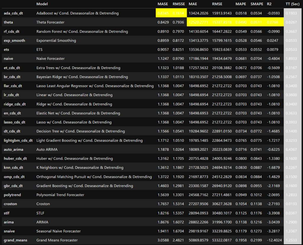
best = exp.compare_models()
final_best = exp.finalize_model(best)
pred = exp.predict_model(final_best).rename(columns={"y_pred": "Forecast"})
pred.index.name = "Date"
# PeriodIndex → DatetimeIndex(matplotlib対応)
if isinstance(pred.index, pd.PeriodIndex):
pred.index = pred.index.to_timestamp()
# 3) 可視化用データ
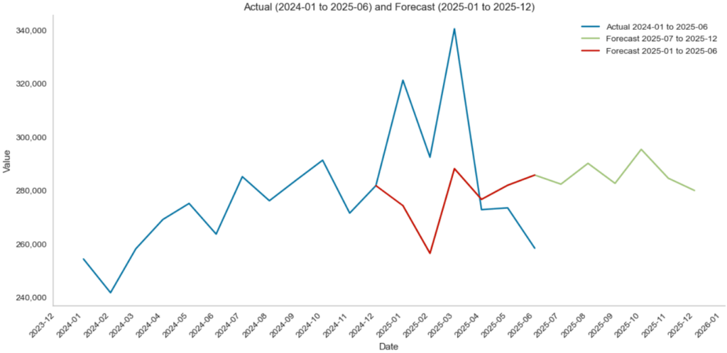
# 実測:2024-01〜2025-06
actual_2024_2025H1 = df.loc["2024-01-01":"2025-06-01"]["Value"]
# 予測:2025-01〜12
forecast_2025 = pred.loc["2025-01-01":"2025-12-01"]["Forecast"]
# 接続線データ:2024-12 実測 → 2025-01〜06 予測
dec_2024 = pd.Timestamp("2024-12-01")
connect_idx = [dec_2024] + list(pd.date_range("2025-01-01", "2025-06-01", freq="MS"))
connect_vals = [float(df.loc[dec_2024, "Value"])] + list(forecast_2025.loc["2025-01-01":"2025-06-01"].values)
# 4) グラフ1:折れ線(上右スパイン削除、Y軸3桁カンマ、グリッド無し、月単位表示)
plt.figure(figsize=(12, 6))
ax1 = plt.gca()
plt.plot(actual_2024_2025H1.index, actual_2024_2025H1.values, label="Actual 2024-01 to 2025-06")
plt.plot(forecast_2025.index, forecast_2025.values, label="Forecast 2025-07 to 2025-12")
# 前段で作った接続線(必要な場合のみ。スタイル指定なし)
plt.plot(connect_idx, connect_vals, label="Forecast 2025-01 to 2025-06")
plt.title("Actual (2024-01 to 2025-06) and Forecast (2025-01 to 2025-12)")
plt.xlabel("Date"); plt.ylabel("Value"); plt.legend()
plt.grid(False)
# スパイン非表示(上・右)
ax1.spines["top"].set_visible(False)
ax1.spines["right"].set_visible(False)
# X軸:月ごと表示、傾け
ax1.xaxis.set_major_locator(mdates.MonthLocator(interval=1))
ax1.xaxis.set_major_formatter(mdates.DateFormatter("%Y-%m"))
plt.setp(ax1.get_xticklabels(), rotation=45, ha="right")
# Y軸:3桁カンマ(整数)
ax1.yaxis.set_major_formatter(comma_int)
plt.tight_layout()
plt.savefig("line_2024_2025.jpg", dpi=200, bbox_inches="tight") # JPEG保存
plt.show()
# 5) グラフ2:棒(差分:予測−実測)/上右スパイン削除、Y軸3桁カンマ、グリッド無し、月単位表示、値表示
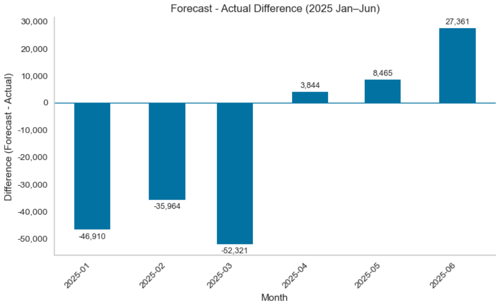
actual_2025_h1 = df.loc["2025-01-01":"2025-06-01"]["Value"]
forecast_2025_h1 = forecast_2025.loc["2025-01-01":"2025-06-01"]
diff_h1 = forecast_2025_h1 - actual_2025_h1
fig, ax2 = plt.subplots(figsize=(8, 5))
bars = ax2.bar(diff_h1.index, diff_h1.values, width=15)
ax2.axhline(0, linewidth=1)
plt.title("Forecast - Actual Difference (2025 Jan–Jun)")
plt.xlabel("Month"); plt.ylabel("Difference (Forecast - Actual)")
plt.grid(False)
# スパイン非表示(上・右)
ax2.spines["top"].set_visible(False)
ax2.spines["right"].set_visible(False)
# X軸:月ごと表示、傾け
ax2.xaxis.set_major_locator(mdates.MonthLocator(interval=1))
ax2.xaxis.set_major_formatter(mdates.DateFormatter("%Y-%m"))
plt.setp(ax2.get_xticklabels(), rotation=45, ha="right")
# Y軸:3桁カンマ(整数)
ax2.yaxis.set_major_formatter(comma_int)
# 棒の上(正)/下(負)に整数値を表示
for b in bars:
h = b.get_height()
label = f"{h:,.0f}"
if h >= 0:
va, y, dy = "bottom", h, 3
else:
va, y, dy = "top", h, -3
ax2.annotate(label,
xy=(b.get_x() + b.get_width()/2, y),
xytext=(0, dy),
textcoords="offset points",
ha="center", va=va, fontsize=9)
plt.tight_layout()
plt.savefig("bar_diff_2025H1.jpg", dpi=200, bbox_inches="tight") # JPEG保存
plt.show()
Prophetによる予測
import pandas as pd
from prophet import Prophet
import matplotlib.pyplot as plt
import matplotlib.dates as mdates
import matplotlib.ticker as ticker
# データ読み込みと整形
df = pd.read_csv("US_IM_prophet.csv")
df['ds'] = pd.to_datetime(df['ds'])
# Prophetモデル学習
m = Prophet()
m.fit(df)
# 月単位で2025年12月までの予測を行う
future = m.make_future_dataframe(periods=24, freq='MS')
forecast = m.predict(future)
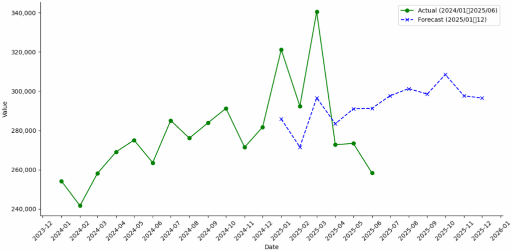
# 実測値: 2024年1月~2025年6月
actual = df[(df['ds'] >= '2024-01-01') & (df['ds'] <= '2025-06-30')]
# 予測値: 2025年1月~12月
predicted = forecast[(forecast['ds'] >= '2025-01-01') & (forecast['ds'] <= '2025-12-31')]
# グラフ描画(Matplotlib)
fig, ax = plt.subplots(figsize=(12, 6))
ax.plot(actual['ds'], actual['y'], color='green', linestyle='-', marker='o', label='Actual (2024/01〜2025/06)')
ax.plot(predicted['ds'], predicted['yhat'], color='blue', linestyle='--', marker='x', label='Forecast (2025/01〜12)')
# 軸ラベル設定
ax.set_xlabel('Date')
ax.set_ylabel('Value')
# グリッド非表示
ax.grid(False)
# X軸:1か月ごとの表示
ax.xaxis.set_major_locator(mdates.MonthLocator())
ax.xaxis.set_major_formatter(mdates.DateFormatter('%Y-%m'))
# Y軸:3桁区切り(カンマ付き)
ax.yaxis.set_major_formatter(ticker.FuncFormatter(lambda x, _: f'{int(x):,}'))
# 上下の枠線削除
ax.spines['right'].set_visible(False)
ax.spines['top'].set_visible(False)
# X軸ラベルを自動回転
plt.xticks(rotation=45)
# 凡例とレイアウト
plt.legend()
plt.tight_layout()
plt.show()
# CSV出力
combined.to_csv("actual_forecast_2024_2025.csv", index=False)